We’re getting Sharepoint at work.
Thank you, one and all, for your kindly and sympathetic looks as you read that sentence.
It’s led to some soul-searching in the team I work in, as among the problems we have with it are that we just don’t like the design. There’s a menu down the left-hand side, which was sized so that it didn’t show the full label until you hovered over it. This was replaced with a menu with ‘+’ symbols next to it to show that there was a sub-menu. And the main content is held in a fixed-width table.
The 1990s called, they’d like their website back…
But it reminded me that I’ve built more than a few dodgy-looking websites over the years. When I started we had to build them by hand, typing in all that HTML. Nowadays you can use WordPress to do the heavy lifting, as with this site. That doesn’t mean they will be better, however. These days we have to design “mobile first”, sites which degrade gracefully when viewed on a small iPhone screen but which expand to fill more of the screen on a, say, 21” monitor.
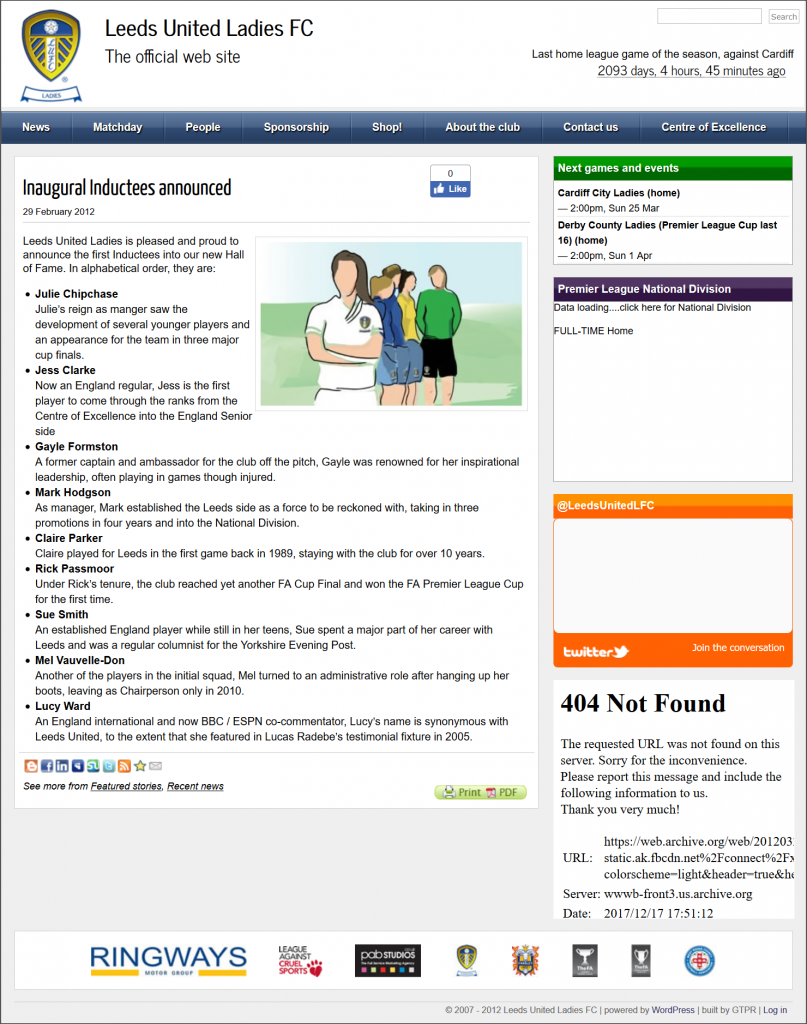
Which brings me to the former Leeds United Ladies website, archived by the Wayback Machine. Because, while it looks quite good on my laptop (it was designed on and for my former 10.1” laptop, after all), it doesn’t look so good when you shrink the screen size down. With the benefit of several years more experience I’d be using various .css calls to move the right-hand elements down, space them out differently or hide them. And that menu would be a ‘proper’ WordPress menu, not a plugin.
The Hall of Fame Dinner never happened, and there’s no club now (not the club I knew anyway – who knows what’s happening now?) but I’ve always been tempted to convert that template into something more responsive and flexible. Maybe not for selling, or uploading to wordpress.org, but just for my own satisfaction of a job well done.
I am off work between Christmas and New Year, so you never know… I still have the original files somewhere.

